
This post is the companion to an earlier one that I wrote about conference abstracts. In the same way that the last one was inspired by reviewing a ton of abstracts and noticing a recurring pattern in my suggestions, so this one comes from reviewing a bunch of slide decks for a forthcoming conference. They all look like good talks, but in several cases these great talks are fighting to get out from underneath the deadening weight of slides.
Herewith follows my highly-opinionated, fairly-subjective, and extremely-terse advice and general suggestions for slide decks. You can also find relating ramblings in this recent post too. My friend and colleague Vik Gamov also wrote a good post on this same topic, and linked to a good video that I’d recommend you watch.
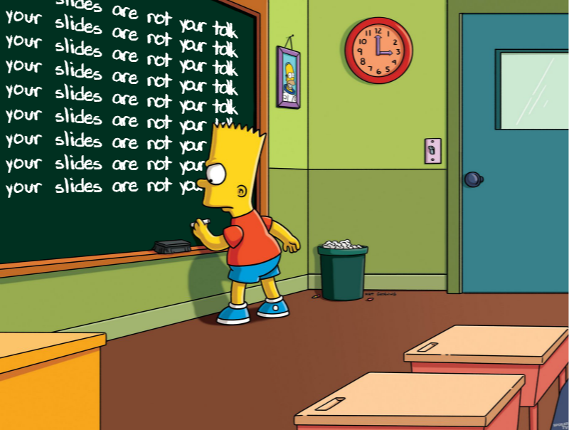
Your slides are not your talk 🔗
Your slides are a visual aid for the audience. I have only just begun to really move away from this in my presentation style, and it is both liberating and scary at the same time.
It’s liberating because you now have the audience’s full attention and can really tell them the story you want to. It’s scary because you now have the audience’s full attention, and no slides from which to just read your content.
Slides on the screen behind you whilst you talk are COMPLETELY DIFFERENT from those that you want people to download and peruse and marvel at later.
People feel this itch that more content is better, that it gives them a safety blanket of things to say and talk about and remember to mention. But it’s not, it’s a distraction and a hindrance.
Bullet lists are great for takeaways slides, for things that you want people to access and understand afterwards without needing commentary. But that’s a different type of material that you’re preparing that presentation slides. I’ve seen the advice written to prepare two versions of a deck; one for presenting, one for download. I’ve yet to do that but whether you do or not be very conscious in building your deck of which type it is.
A common mistake is when it comes to code. I see people putting the complete code extract or configuration syntax on a slide. Invariably it is introduced with "you probably can’t read this at the back". Don’t do that. Quote just the relevant bit of code that’s under discussion.
More text is more confusing, is more stuff for people to read on the screen.
If they’re reading your slides they’re not listening to you 🔗
If it’s there, we’ll read it. The adverts on the underground (/metro/subway). A billboard at a traffic junction. The text on slides in a conference talk. And if we’re reading, we’re not giving our full concentration to what’s being said. I mean, there’s that nice lulling feeling of words going into our ears, sure, but now our brain is multitasking in groking two things. And I don’t know about you but whilst I can wash the dishes whilst giving my full concentration to a podcast, I sure as heck can’t comprehend what I’m reading whilst comprehending what I’m hearing.
It’s OK not to mention everything 🔗
Starting out with my first ever conference talk I saw slides as being the canvas upon which I must scribe my life’s work and understanding in the given subject of the talk. Every I must be dotted, every T crossed, every configuration option listed, every component explained. Wrong.
You have a time slot of 30 minutes in which to expound upon a very specific thing that you promised in your abstract. If it’s a technology-focussed conference it’s safe to assume that unless your talk is called "An introduction to <x>" then your audience already knows the basics (or, are open to the fact that they don’t).
Look at your abstract, and think what you want your audience to leave with at the end of it. How much of your slide content contributes to that, and how much is filler and background? Be ruthless, cut it back. Take another look? Does your message still make sense or does it lack context? Maybe add a bit more in. Season your slides sparingly!
Most technologies nowadays are so complex that you have to focus on just a particular part of it. If you try to prepare the audience with a full briefing on the technology, plus every other tool that you happen to mention as you go through your talk, they won’t really take anything useful away—unless your talk is "a primer to the <xyz> technology stack and ecosystem"
Use Less Text & Make the font bigger Bigger BIGGER 🔗
Make the font bigger. It makes more impact, it’s easier to read. You might have the luxury of presenting in a cinema with a ginormous screen behind you, but you might have a crappy beamer with a room of 100 people and half of whom can’t read what you wrote.
-
"But I can’t fit all my text on if I make it bigger"
-
→ Bingo, you’ve got too much text. Very, very rarely will there be text that absolutely must be on a slide and must be on the same slide. Most of the time you can either:
-
Cut the extra text entirely
-
Split the text over multiple slides
-
-
There’s this rule of thumb about slides-per-minute, and one slide per minute of talk. It’s kinda useful to gauge if you’re in the right ballpark, but in the law of unintended consequences, I think it leads people to think they must have fewer slides—and just put more on each. Much better to take a dense slide with three points on, split it over three, and rehearse your talk so that as you make those three contiguous points you’re clicking between the associated slides. And if it all needs to be on one, to emphasise some big point that you’re making, then you need a handful of words at most.
tl;dr 🔗
If I was to put this article into a slide deck (and maybe I should…) I’d put something like:
-
The slides are not your talk
-
Big Font
-
Less Text
Slides give you a basis from which to talk, and give the audience something to look at (not read) in between gazing in adoration as they listen to your dulcet tones.
Bonus content 🔗
Two years on from writing this original article, I took to Twitter to voice more thoughts on the matter:
I've been doing this #DevRel thing as an actual job title for nearly three years now, so does that qualify me to tweet some Pro-tips? Or they're maybe just tips? 🤔
— Robin Moffatt 🍻🏃🥓 (@rmoff) March 19, 2021
🤷♂️ Anyway, here are some things you really should stop doing in your presentation decks.
🧵 👇
Your slides are not your talk
— Robin Moffatt 🍻🏃🥓 (@rmoff) March 19, 2021
Your slides are not your talk
Your slides are not your talk
Your slides are not your talk
Your slides are not your talk pic.twitter.com/YqMYGVMJRN
Your slides are a *prop* for the talk that *you* are delivering.
— Robin Moffatt 🍻🏃🥓 (@rmoff) March 19, 2021
If I can just download your slides and imbibe the knowledge you wish to impart from the slides alone, what's the point of listening to your talk?
By all means, create a version of your slides that can be shared afterwards that flesh out your talk. But please don't create slides that the audience will be too busy reading to be able to pay attention to you
— Robin Moffatt 🍻🏃🥓 (@rmoff) March 19, 2021
Your slides will probably be 16:9 and need to be readable at 1280x720 at least - and probably aim for even lower res. That means you need to make the most of your slide space.
— Robin Moffatt 🍻🏃🥓 (@rmoff) March 19, 2021
Resist the default assumption that you've got a header of a couple of hundred pixels for a slide title, and the same for a footer. Maybe you are obligated to include your corp logo, but not always. Does the slide *need* a title, or would it work just as well without?
— Robin Moffatt 🍻🏃🥓 (@rmoff) March 19, 2021
Be aggressive with what's allowed on your slide. Every bit of text takes space, and is something for the audience to look at and perhaps be distracted with. Twitter handle on each slide is generally a good idea. The title of your talk, company tagline, etc, probably not.
— Robin Moffatt 🍻🏃🥓 (@rmoff) March 19, 2021
😏 Do you *really* need an agenda slide? They're a crutch, just like a bio slide. It gives you a nice comfortable familiar way to warm up your voice, settle your nerves…and bore your audience. Consider instead just *telling* your audience what the agenda is 😱
— Robin Moffatt 🍻🏃🥓 (@rmoff) March 19, 2021
🖼️Paint a picture, set the scene. 🎣Give them a hook, give them a reason to pay attention (instead of opening a new browser tab obscuring the one in which your talk is invariably being delivered these days)
— Robin Moffatt 🍻🏃🥓 (@rmoff) March 19, 2021
👤Sure bio slides are nice too, but make sure they're serving a purpose (such as establishing your credibility to speak about the topic) and not just boring them with your resume 👨💼
— Robin Moffatt 🍻🏃🥓 (@rmoff) March 19, 2021
💡Woke: I built this thing and have good lessons to share with you, that's why you should be listening to me
— Robin Moffatt 🍻🏃🥓 (@rmoff) March 19, 2021
🥱Broke: I've been working in IT for 20 years ergo I must have something to say
🥇 Here's a great example of drawing the audience in, from @nathenharvey: https://t.co/RdgGx3q9lu. 💥BAM💥 straight into it, and you're hooked. Three and a half minutes later, bio slide and introduction, but already audience is going to be 💯engaged
— Robin Moffatt 🍻🏃🥓 (@rmoff) March 19, 2021
🥇Another good one (no recording 😞) was @recursivecodes at #KScope19 in which he just started chatting about where he lived, and wove in details of what he was building (it was pretty cool: https://t.co/0ASbR6FmyS) and told a great story that engaged the audience from the start
— Robin Moffatt 🍻🏃🥓 (@rmoff) March 19, 2021
bonus tweet - @lornajane reminded me of the very appropriate quotation that can be equally applied to the contents of slides:
— Robin Moffatt 🍻🏃🥓 (@rmoff) March 19, 2021
“I apologize for such a long letter - I didn't have time to write a short one.”
Addenda (Apr 2022) 🔗
-
If you Twitter, put your Twitter handle on every slide.
-
Some people in the audience will like to tweet "Watching <x> talk about <y>" and having your handle on the title slide helps them.
-
Some people will like a particular slide that you created and will want to tweet that - if it’s got your handle on it then they can easily attribute it to you and anyone seeing the tweet sees your handle on it too even if they don’t tag you.
-
-
Part of the benefit of the live conference experience for attendees is being able to ask questions, so plan to allow 5-10 minutes for questions.
-
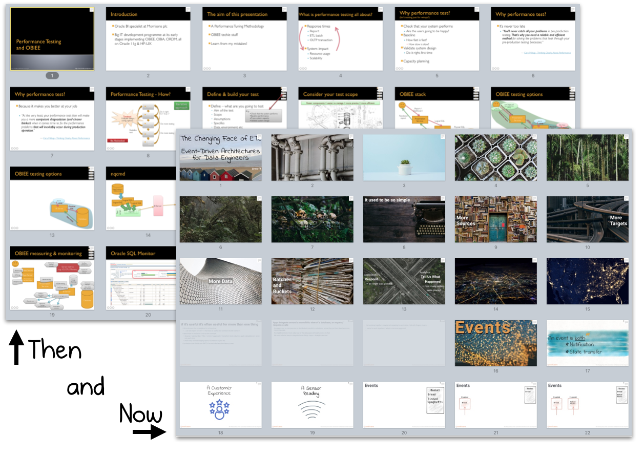
A very rough rule of thumb is one slide per minute. So if you’re going to speak for 35 minutes and have 80 slides,
just speak really fastconsider trimming them down -
Always remember what your talk title and abstract are. This is what you pitched to the program committee who accepted your talk on that basis, and it’s what the audience will have read in the agenda and chosen to attend your session based on.
-
This can be useful to refocus a slide deck that’s maybe getting long or a bit woolly. Chuck out the kitchen sink, maybe ditch some of the preamble, and focus on the story/learnings/insights that you’ve promised to share :)
-