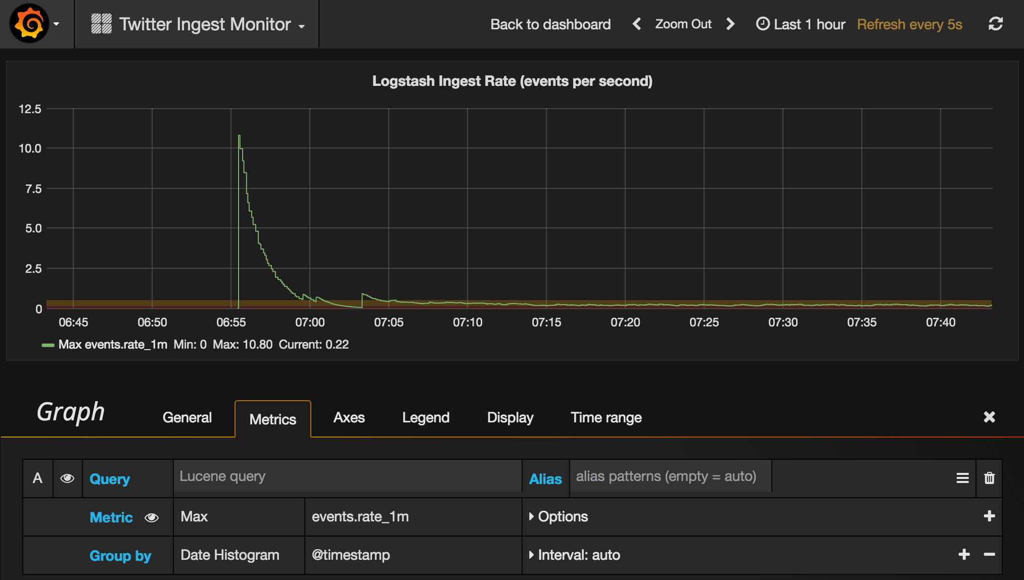
Yesterday I wrote about Monitoring Logstash Ingest Rates with InfluxDB and Grafana, in which InfluxDB provided the data store for the ingest rate data, and Grafana the frontend.
Mark Walkom reminded me on twitter that the next release of Logstash will add more functionality in this area - and that it’ll integrate back into the Elastic stack:
@rmoff nice, LS 5.0 will have APIs exposing metrics too. they’ll be integrated back into Marvel/Monitoring! :)
— Mark Walkom (@warkolm) May 12, 2016
Which then got me thinking – why add in InfluxDB and Grafana, if you’re already using another datastore and front end (Elasticsearch and Kibana)? Well, I touched on this yesterday, and I would still opt for InfluxDB & Grafana when deploying a metrics-based monitoring solution. But, if your primary focus is on text based data (such as log files), rather than metrics alone, Elastic stack will be just great for you. And so in this scenario, let’s bring the ingest rate monitoring back in house!
Logstash Configuration 🔗
This is the same as before, except the output stanza points to Elasticsearch:
input {
    # Input code goes here
}
filter {
    # Any other filter code goes here
    #
    # [...]
    #
    metrics {
        meter => "events"
        add_tag => "metric"
    }
}

output {
    if "metric" in [tags] {
        elasticsearch { hosts => 'localhost'
                        index => "logstash-metrics"
        }
    } else {
    # Output code goes here
    #
    # [...]
    #
    }
}
After making this change, restart your Logstash agent.
Checking the data’s arriving 🔗
I’ve been working with Elastic stack for a few years now, and can’t believe that it’s only recently I’ve discovered Sense. It’s a plugin for Kibana, and makes working with the Elasticsearch REST API a real pleasure:
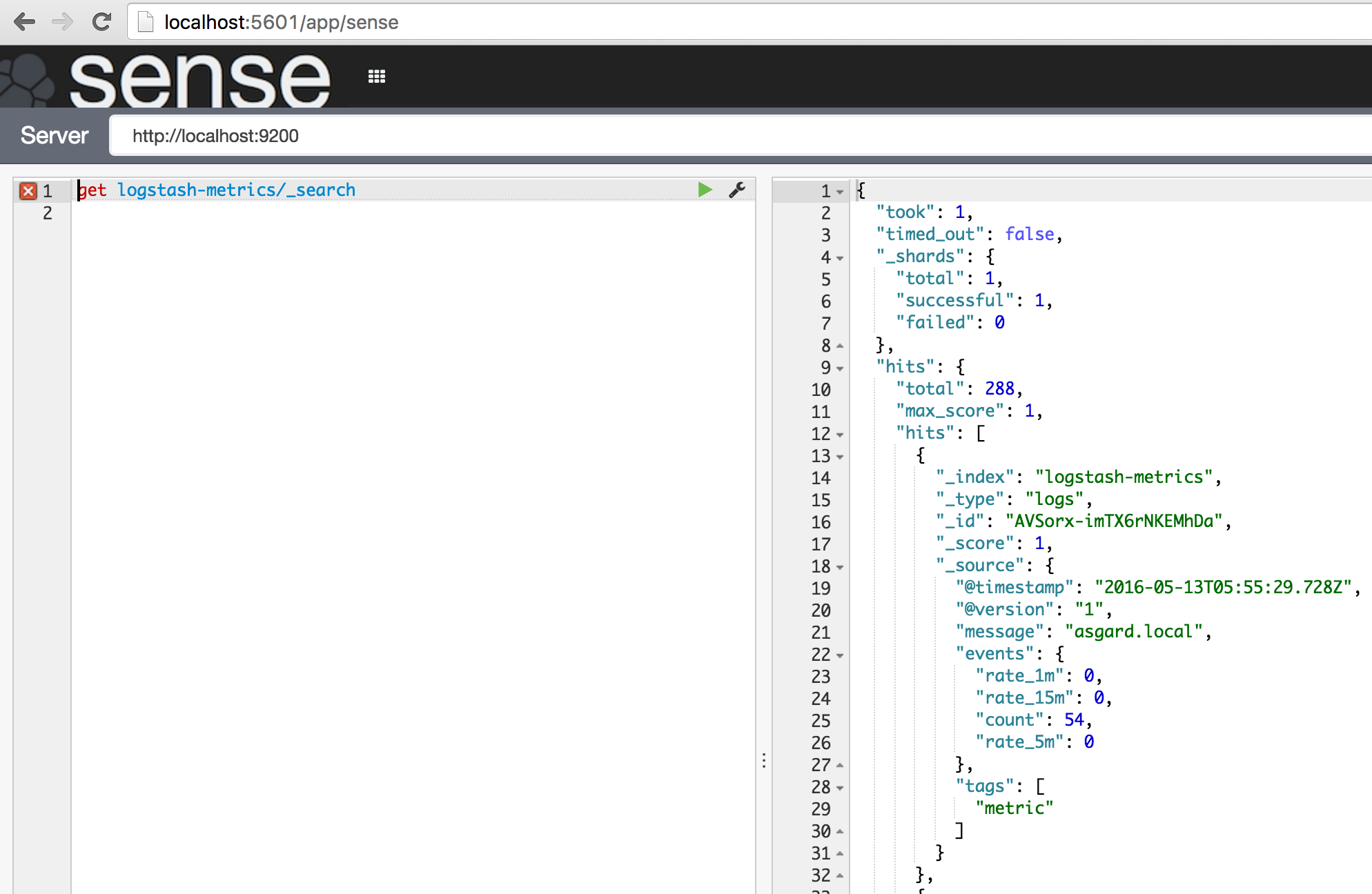
So we can see in the new Elasticsearch index logstash-metrics the data’s coming through. All good - now onto the graphs!
Graphing it in Kibana 🔗
You’ve two options for visualising the data here - the Line Chart, or Timelion. Timelion is still in beta, but longer-term will absolutely be the right choice for this kind of visualisation. So, let’s do both!
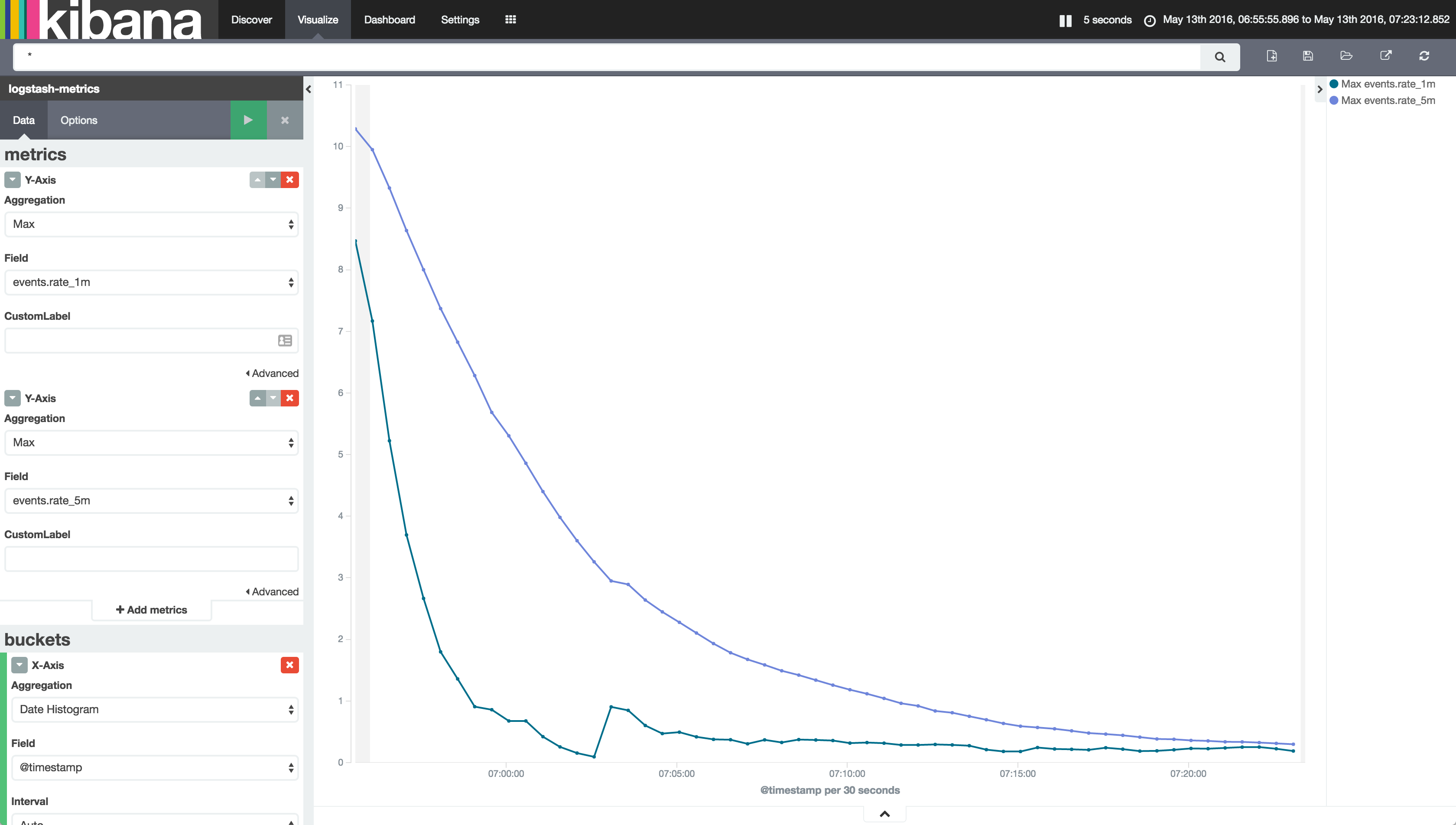
The Line Chart is pretty simple. Set the metric aggregation to Max (instead of Count), and choose the relevant metric field. I’ve gone for rate_1m and added a second Y-axis metric for rate_5m. On the X-axis it’s just split out as a date histogram:
The Timelion chart is a tad more complex to build, but ultimately better. Since I’ve got Timelion installed and am running Kibana 4.5, “Timeseries” shows up as a Visualisation option for me when I create a new one. To start with the blank configuration is a bit daunting:
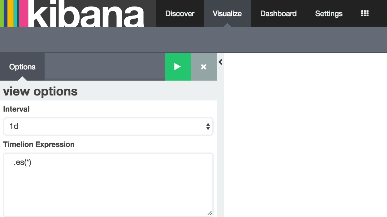
Set the Interval to other and then 5s in the box that appears. Amend the Timelion Expression to
.es(index=logstash-metrics)
Hit the play button:
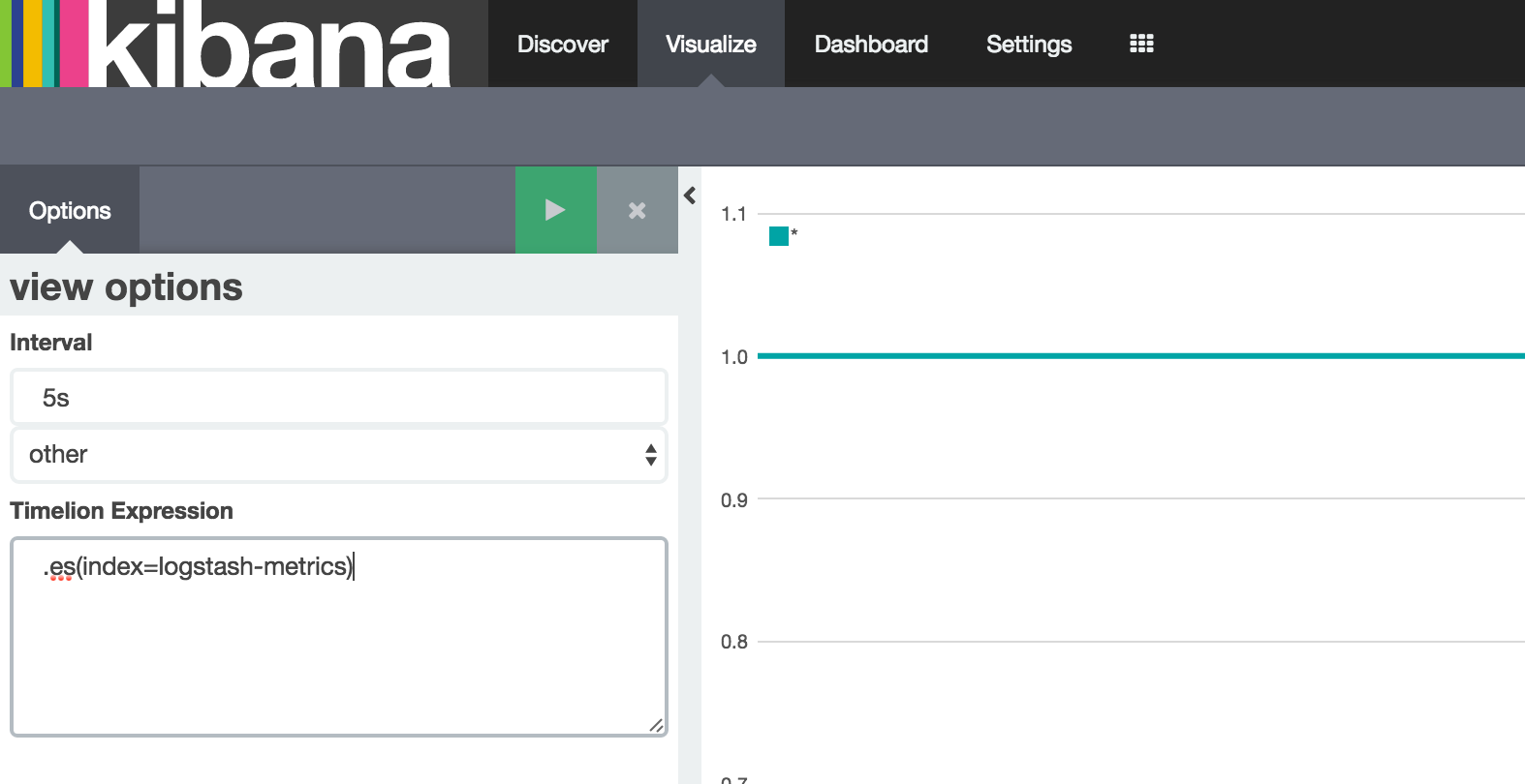
Ah - not quite what we expected. That’s because we’re seeing by default a Count, which is generally 1 per Interval. Let’s fix that:
.es(index=logstash-metrics,metric=max:events.rate_1m)
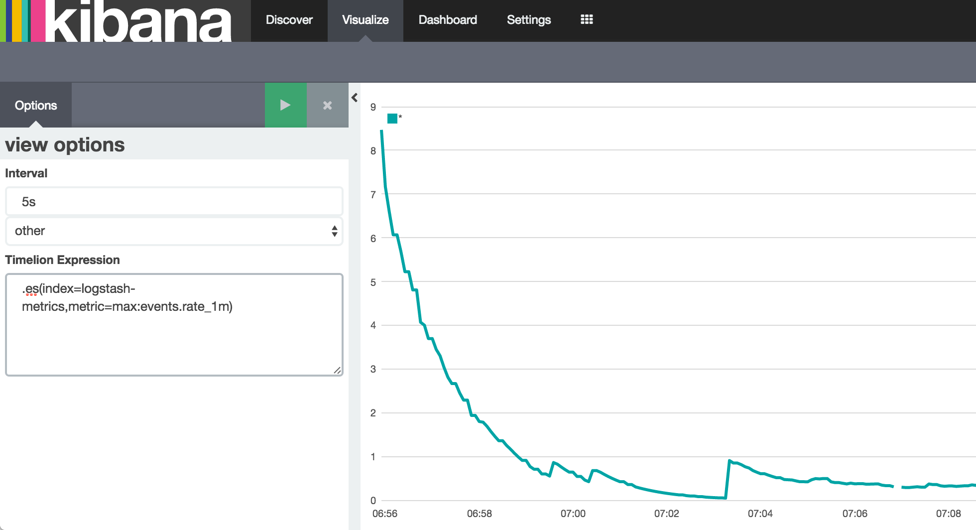
Tada!
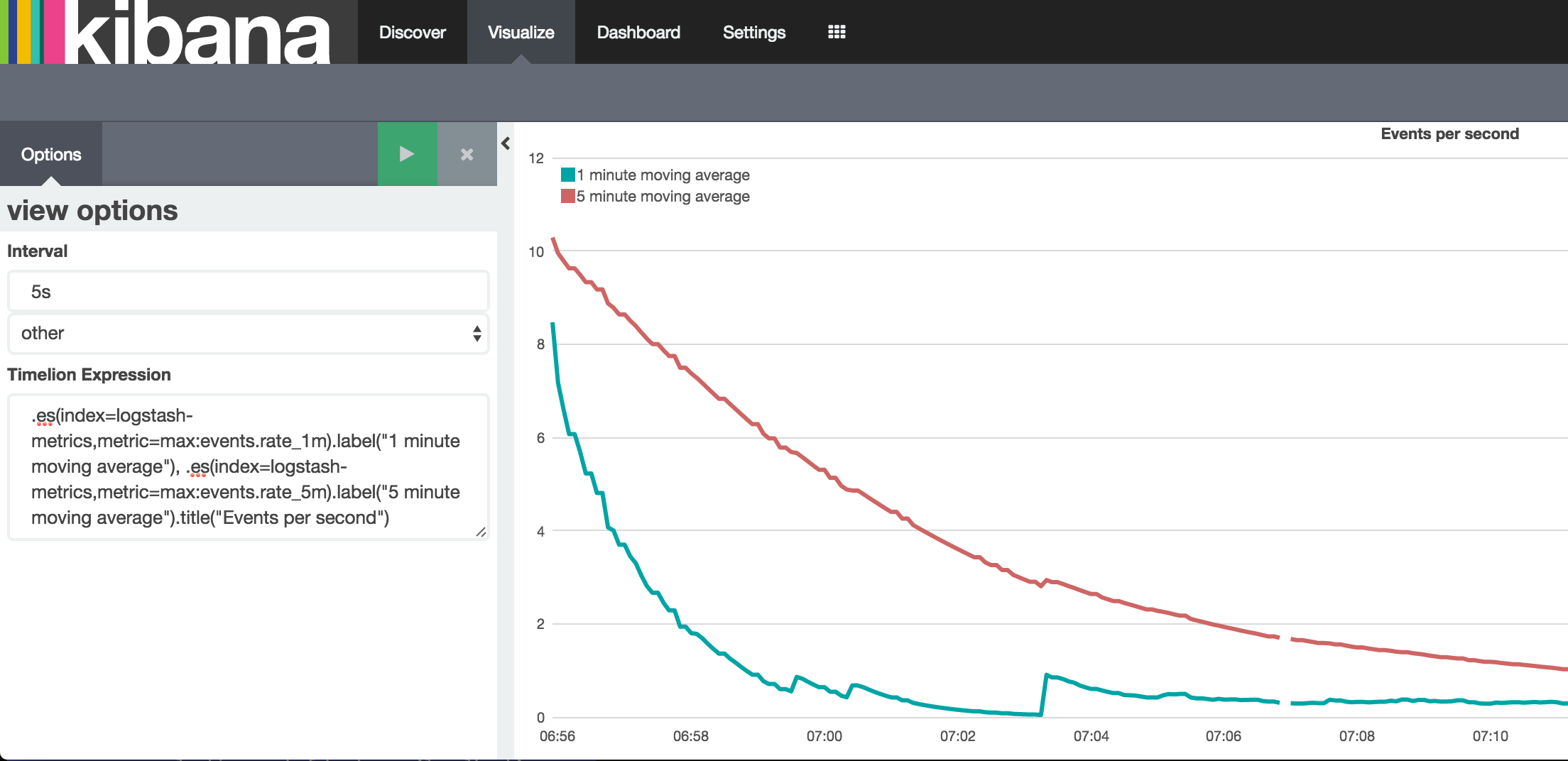
But, let’s not stop there, let’s see what Timelion can do. A second series? Sure:
.es(index=logstash-metrics,metric=max:events.rate_1m), .es(index=logstash-metrics,metric=max:events.rate_5m)
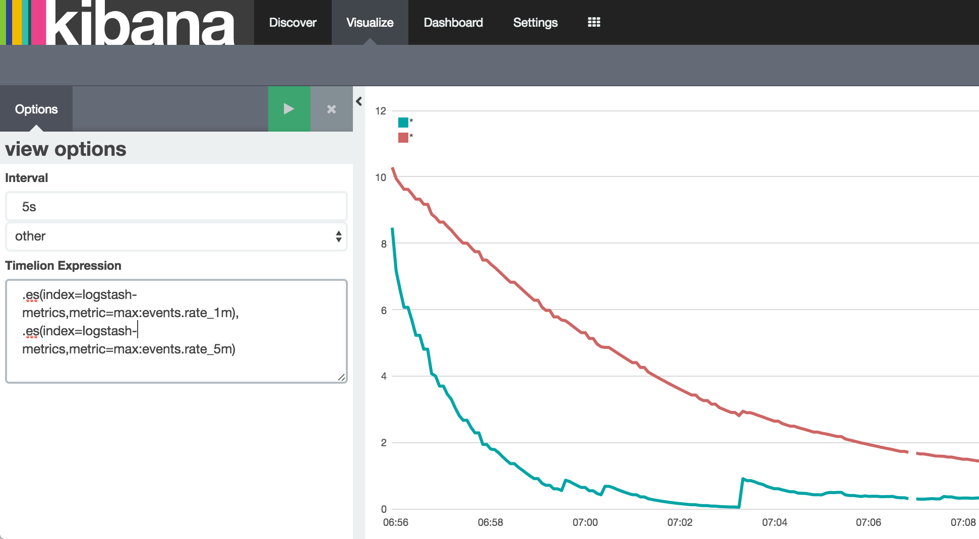
Looks good - but which is which? And how about a title for the chart? label and title functions to the rescue!
.es(index=logstash-metrics,metric=max:events.rate_1m).label("1 minute moving average"), .es(index=logstash-metrics,metric=max:events.rate_5m).label("5 minute moving average").title("Events per second")

Let’s save the visualisation, and include it on the dashboard with our actual data:
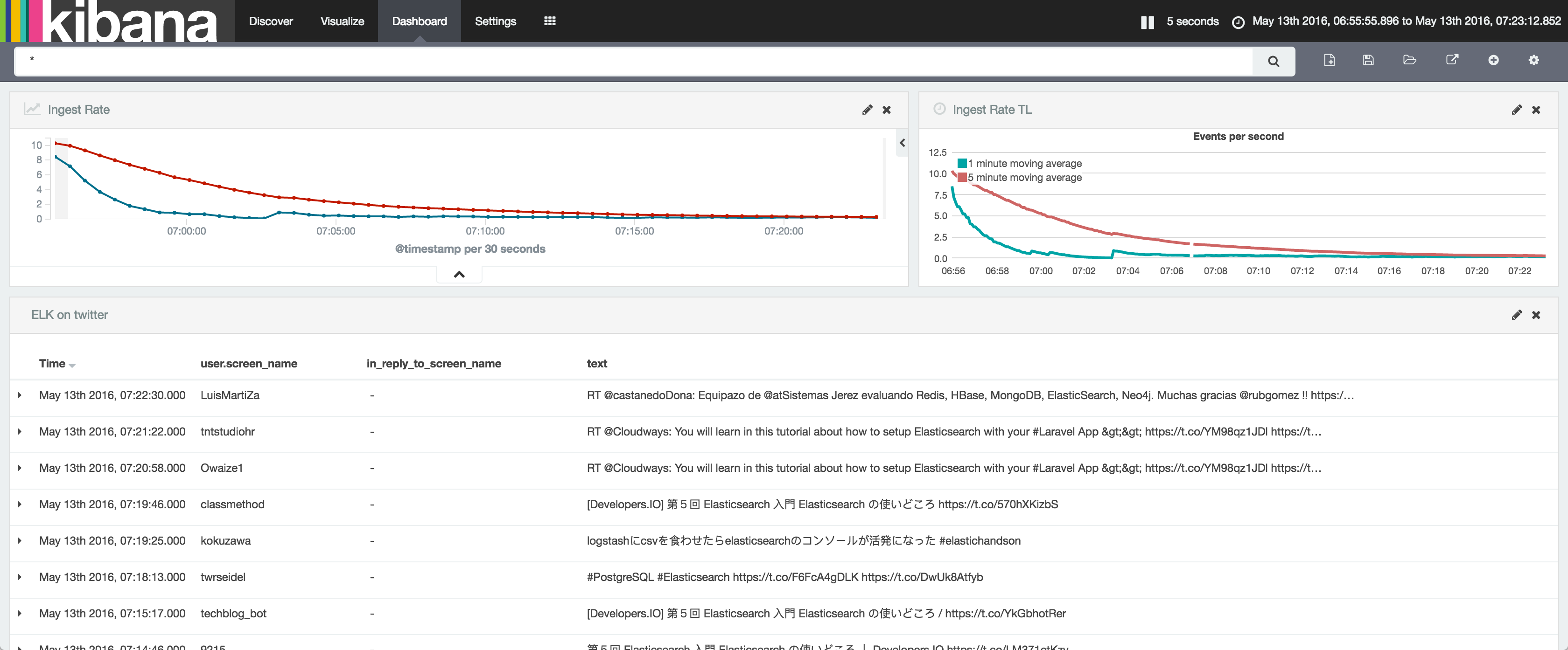
So - ingest rate monitoring within the Elastic stack? Done. Ingest rate monitoring if you’re also using InfluxDB & Grafana? Done! And just to round off all permutations - you want to store your data in Elasticsearch, but just love how Grafana looks? Not a problem, since Grafana support Elasticsearch as a data source:
